
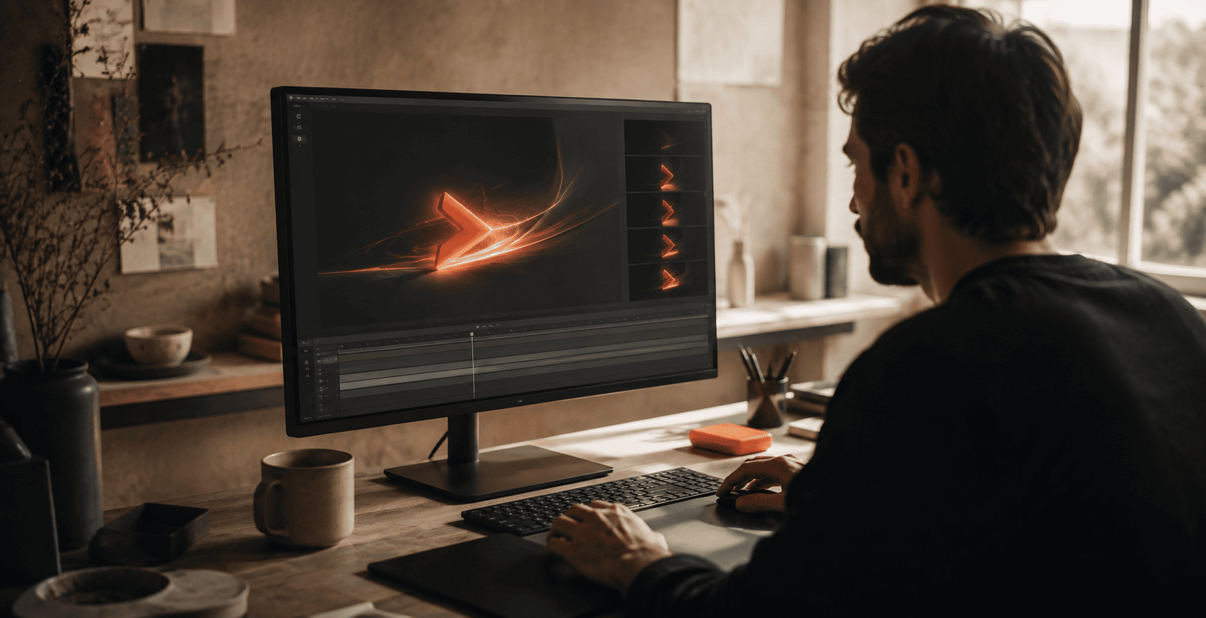
Think about the last logo that stuck with you. Chances are it did not just sit still on a page. It moved when an app opened, it had a colour that felt like something, and it stood for an idea you understood in a second. That is where branding is heading in 2026. A logo is no longer a quiet little mark you stamp on things. It moves, it carries a mood, and it means something.
For years, a rebrand meant drawing a fresh logo and picking a couple of colours. That is not enough anymore. Your brand now lives on phones, apps, reels, and even inside AI answers. It has to work in all of those places and still feel like you. This is a simple, practical playbook for a 2026 rebrand, built around three ideas that actually matter: motion, mood, and meaning.
Why Static Logos Are No Longer Enough
Not long ago, a logo had one main job. It had to look good on a sign, a business card, and the top of a website. Those were mostly still, printed places, so a still image did the trick.
Today your brand shows up in motion far more than in print. It appears as an app icon that animates, a loading screen, a social video intro, a website that reacts as you scroll. In all these moments a flat, frozen logo can feel a little lifeless. Designers now talk about brands going beyond skin deep, which simply means a good identity needs real substance, not just a pretty surface. The mark has to move well, feel like something, and carry a clear idea.
A logo used to be something you looked at. In 2026, it is something people experience.
Motion: Give Your Logo a Life of Its Own
Motion is the first big shift. A motion logo is your mark designed to move with purpose. Maybe the letters draw themselves in when your site loads. Maybe a shape gently unfolds when someone opens your app. Maybe your logo has a short signature animation you use at the start of every video.
This matters because movement grabs attention and sticks in memory better than a still image. It also makes your brand feel modern and alive on the screens where most people meet you. You do not need constant animation everywhere. You need a few well-planned moments where your logo moves in a way that feels natural and unmistakably yours.
The key is to design the behaviour, not just the picture. How fast does it move? Does it feel playful or calm? Does the motion echo something about your business? A good motion logo answers these questions, so the movement adds meaning instead of noise.
Mood: Make People Feel Something
The second shift is mood. Mood is the feeling your brand gives someone in the first second, before they read a single word. It comes from your colours, your type, your shapes, your images, and increasingly your sound.
Colour sets the emotional tone, so warm and earthy feels very different from bright and bold. Type adds personality, from friendly and rounded to sharp and confident. Even sound is part of branding now. A short, recognisable audio signature, the kind you hear when a popular app opens, is becoming a real part of identity because so much content is watched with the volume on.
When all these pieces point at the same feeling, your brand becomes easy to recognise and hard to forget. When they clash, people feel the confusion even if they cannot name it. Getting the mood right is often the difference between a brand that feels professional and one that feels thrown together.
- MotionHow your logo and brand move on screens, from app icons to video intros and website loads.
- MoodThe feeling created by colour, type, shape, imagery, and sound, all pointing at one emotion.
- MeaningThe idea and story your brand stands for, so people connect with more than just the look.
Meaning: Stand for Something Real
The third shift is the deepest one. Meaning is the idea behind your brand. It is the reason you exist beyond making money, and the story people repeat when they recommend you.
In a crowded market, a nice logo is not enough to make someone choose you. People connect with brands that feel like they believe in something and know who they serve. That belief should show up everywhere, in the words you use, the causes you support, the way you treat customers, and yes, the design choices you make. When your look and your message tell the same story, the brand feels honest and trustworthy.
Meaning also keeps you consistent as you grow. When everyone on your team understands what the brand stands for, every new post, page, and product feels like part of the same family. That consistency is what makes a brand recognisable, even inside AI-driven search, a point we explored in our guide to Generative Engine Optimization and why ranking on Google isn't enough anymore.
The 2026 Rebrand Playbook
So how do you actually do this? Here is a simple step by step approach you can follow, whether you are refreshing a small business or rebuilding a bigger brand.
1. Start with why, not with the logo
Before anyone opens a design tool, get clear on the basics. Who do you serve, what do you stand for, and how do you want people to feel? This is the meaning layer, and every design choice should flow from it. Skipping this step is why so many rebrands look nice but say nothing.
2. Build a system, not just a mark
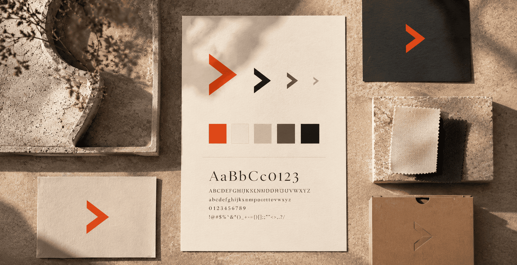
Design a full identity, not a lonely logo. That means a primary logo, simpler versions for small spaces, a colour palette, fonts, image style, and clear rules for how they all fit together. A proper system keeps your brand looking sharp everywhere it appears.
3. Design for motion from the start
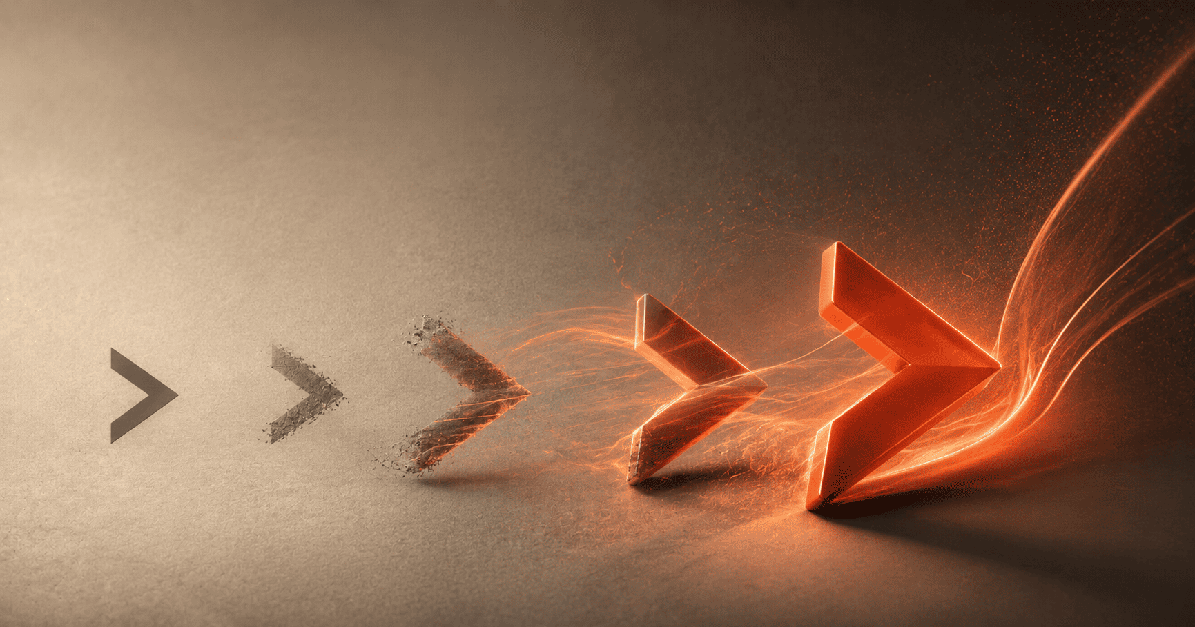
Plan how your brand moves early, not as an afterthought. Decide on a signature animation for your logo, and keep motion simple and consistent so it works on both fast and slow devices. If most people see your brand on a screen, it should be built for the screen.
4. Set the mood on purpose
Choose colours, type, and even a sound that match the feeling you defined in step one. Test them together, not in isolation, because mood comes from how everything works as a whole. If the feeling is off, adjust before you go further.
5. Test it in the real world
Before you launch, see your brand where it will actually live. Put it on a phone screen, a social post, a website header, and a video intro. Shrink the logo down and check it still reads. Real places reveal problems that a neat presentation slide never will.
6. Roll it out with a story
A rebrand is a chance to reconnect with your audience, so do not just swap the logo overnight and stay silent. Share why you changed, what the new look means, and where you are heading. People support brands they feel part of.
Thinking about a rebrand?
We build complete brand identities with motion, mood, and meaning, from logo to full system. Strategy, design, and rollout under one roof.
Start your rebrandOne Honest Note
A rebrand is powerful, but it is not always the answer. If your brand is still working well and people recognise it, a full change can do more harm than good. Sometimes a lighter refresh, cleaning up your logo, tightening your colours, and adding a little motion, gives you most of the benefit without the risk of losing what people already love. The goal is not change for its own sake. The goal is to become clearer, more modern, and more yourself. Be honest about which one you actually need.
The Bottom Line
Branding in 2026 asks more of a logo than ever before. It should move with purpose, carry a mood people feel, and stand for a meaning they believe in. Get those three things working together and you have more than a pretty mark. You have an identity that feels alive, earns trust, and stays with people long after they close the tab.
If your current brand feels flat, dated, or just not quite you anymore, this is a good moment to rethink it. A brand built around motion, mood, and meaning is not a luxury in 2026. It is how you stay memorable in a very crowded world.
Ready to build a brand that moves, feels, and means something?
The Designers World creates modern identities and rebrands for businesses that want to stand out and grow. Let's talk about your brand.
Start a project