
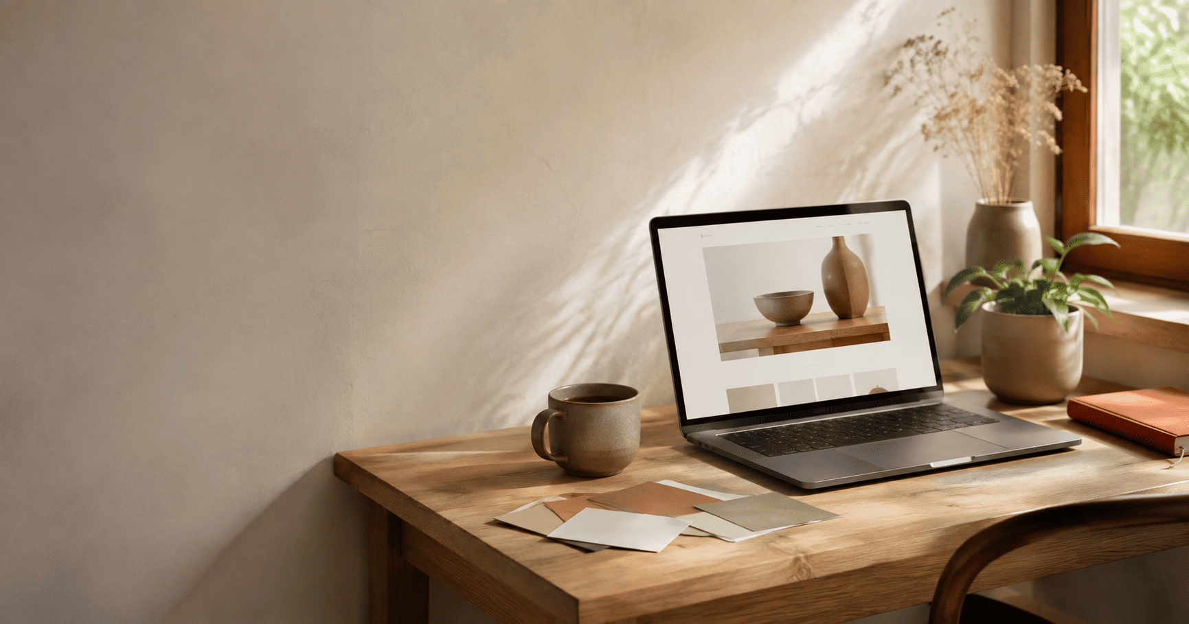
For a few years, websites tried very hard to impress you. Big parallax scrolls, spinning 3D objects, glowing gradients, and animations firing on every click. It looked exciting at first. Now it mostly feels tiring. In 2026, the mood has shifted. The websites people trust are calm, warm, and human. This is the look that is quietly replacing all the flash, and it is worth understanding if you run a business.
We call it calm, tactile, human design. Calm because it gives your eyes room to rest. Tactile because it brings back texture and warmth, so a flat screen feels a little more real. Human because it feels made by people, for people, not stamped out by a template. Below we explain what the look is made of, why it is happening now, and how to bring it to your own site without losing personality.
What Calm, Tactile, Human Design Actually Means
This is not about stripping everything away until a page looks empty. It is about being intentional. A calm site uses generous space, a clear order of information, and soft, purposeful motion. Nothing jumps at you. Your attention is guided gently to what matters.
The tactile part is the interesting shift. After years of flat, glassy screens, designers are adding gentle texture back in. Think soft paper grain, a hint of film noise, warm shadows, and muted earthy colours. Pantone even named a quiet, soft white called Cloud Dancer as its Colour of the Year for 2026, which tells you where the mood is heading. These small touches give a page a sense of depth and warmth, almost like you could reach out and feel it.
The human part ties it together. That means honest photography of real people and real work instead of glossy stock images. It means friendly, plain language instead of buzzwords. It means small imperfect details, like a hand-drawn mark or a slightly uneven layout, that remind you a person made this.
Flashy design shouts for attention. Calm design earns it. In a noisy web, quiet confidence is what makes people stay.
Why the Flashy Era Is Ending
This is not just a matter of taste. There are solid reasons behind the change, and understanding them helps you make better choices for your own brand.
- FatiguePeople see hundreds of loud, animated sites a week. A calm page now feels like relief, and relief gets remembered.
- SpeedHeavy effects, 3D, and big animation libraries slow pages down, which hurts both search rankings and sales.
- AccessStrong motion can make people feel dizzy or unwell, so respecting reduced-motion settings is now basic good practice.
- SamenessSo many AI-built sites look identical. A warm, human touch is what makes a brand feel real and different.
- TrustHonest, unhurried design signals a business that has nothing to hide, which matters more than ever online.
People are tired. When every site is competing to grab you, the one that lets you breathe stands out. Calm has become a real advantage, not a soft option.
Flashy is slow. Every heavy animation and 3D scene adds weight to your page. Slow pages lose visitors and rank lower on Google. A clean, fast site is not only calmer to look at, it also performs better. This is the same reason a lightweight site helps you get found, a point we made in our guide to Generative Engine Optimization and why ranking on Google isn't enough anymore.
Everything looks the same. With AI tools building websites in minutes, a huge number of sites now share the same shiny, generic style. The way to stand out is no longer another effect. It is warmth, honesty, and a human feel that a template cannot fake.
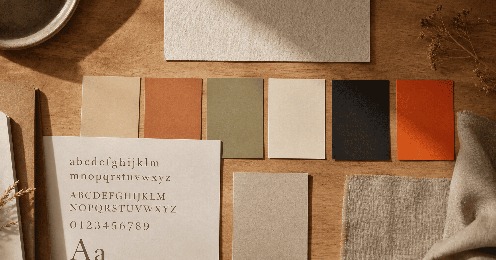
The Building Blocks of the 2026 Look
Here is the practical part. If you want your site to feel calm, tactile, and human, these are the pieces that create it.
1. Warm, muted colours
Swap harsh neon and cold greys for softer, earthy tones. Think warm sand, clay, sage, off-white, and deep ink instead of pure black. These colours feel natural and easy on the eyes, and they let one accent colour do the work of drawing attention.
2. Readable, human typography
Type is doing a lot of the heavy lifting now. Comfortable sizes, relaxed line spacing, and warm humanist or serif fonts make reading feel effortless. A touch of personality in the headings adds character without shouting.
3. Gentle texture and depth
A light paper grain, a soft shadow, or a subtle film noise brings a screen to life. The trick is restraint. You want texture you feel more than notice, just enough to add warmth and stop a page from looking flat and cold.
4. Soft, purposeful motion
Motion is not banned, it is just calmer. A gentle fade as content appears, a slow reveal on scroll, a small hover response. Every movement should have a reason. And always respect a visitor's reduced-motion setting so no one feels unwell on your site.
Want a site that feels calm and still converts?
We design warm, fast, human websites that build trust and turn visitors into customers. Design and development under one roof.
Start your redesign5. Real photography and honest content
Show your actual team, your real space, and your real work. Honest images build more trust than any polished stock photo. Pair them with plain, warm writing that sounds like a person talking, not a brochure.
6. Space and rhythm
White space is not wasted space. Room around your text and images gives the eye a place to rest and makes your message easier to take in. Good spacing is one of the simplest ways to make a site feel calm and expensive at the same time.
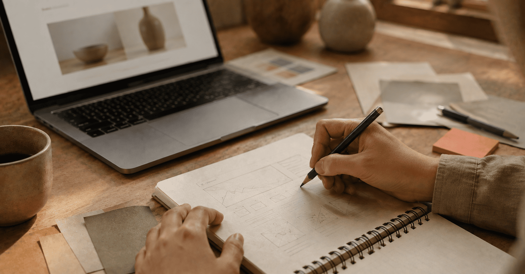
Does Calm Mean Boring?
This is the worry we hear most, and the answer is no. Calm is not the same as dull. A calm site can still have a strong personality, bold headlines, and a memorable colour. The difference is control. Instead of ten things fighting for attention, you have one clear voice. That focus is what makes calm design feel confident and premium rather than plain.
Calm design is also better for business. When a page is clear and quick, people find what they need and take action. Fewer distractions and one obvious next step usually mean more enquiries, not fewer. Beautiful and effective are not opposites, which is exactly the idea behind where creative meets conversion.
The goal was never to do less. It was to do only what matters, and do it beautifully. The thinking behind calm design in 2026
One Honest Note
Not every brand is going quiet. There is also a louder movement in 2026, sometimes called tactile maximalism, with bold colours, big type, and playful energy. It works well for brands aimed at younger, expressive audiences who want personality turned all the way up. So calm is not a rule for everyone. The real lesson is simpler. Choose a direction on purpose to fit your audience, rather than piling on effects just because you can. For most businesses that want trust, clarity, and steady growth, calm and human is the safer and stronger bet.
The Bottom Line
The flashy web is not disappearing overnight, but the shine has worn off. In 2026, the sites that win attention are the ones that feel calm, warm, and made by real people. They load fast, read easily, and treat visitors with respect. That combination builds trust, and trust is what turns a visitor into a customer.
If your website still leans on heavy effects to impress, this is a good moment to rethink it. A calmer, more human design is not a step backward. It is a smarter way to stand out, perform better, and feel genuinely yours.
Ready to give your website a calmer, more human feel?
The Designers World builds warm, fast, high-converting websites and brand systems for businesses that want to stand out for the right reasons. Let's talk about your project.
Start a project